Work / 11 · Campaigns and platform UI
Creative services
From 2011 to 2017 I designed cross-channel campaigns at Tagga: for adidas with the NBA, the NCAA and MLS, for E.D. Smith, and for brands like Kicking Horse Coffee and Lindt. Then I led the UI of the customer data platform they all fed.
- Role
- Lead design, then UI/UX lead
- Year
- 2011–2017
- Status
- Shipped
- Stack
- Campaign sites · Social · In-store print · SMS
- Numbers
- 6 years · 14 E.D. Smith campaigns · 2 MLS seasons
- Links
- Sites retired with the campaigns
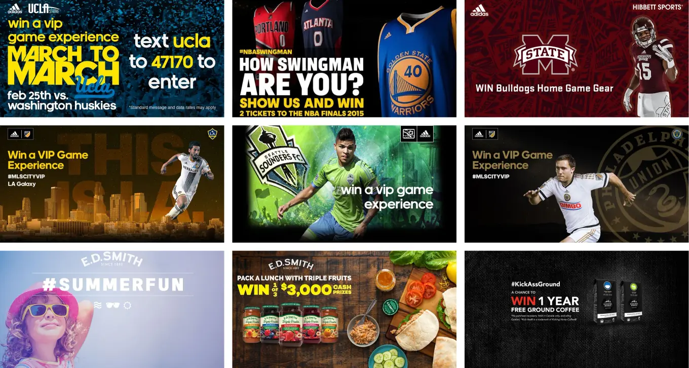
- adidas and the NCAA: stadium video boards asked fans to text a keyword to a short code, and the reply was a link to a mobile entry page.
- adidas and the NBA: How Swingman are you?, a video contest on Instagram and Vine for two tickets to the NBA Finals.
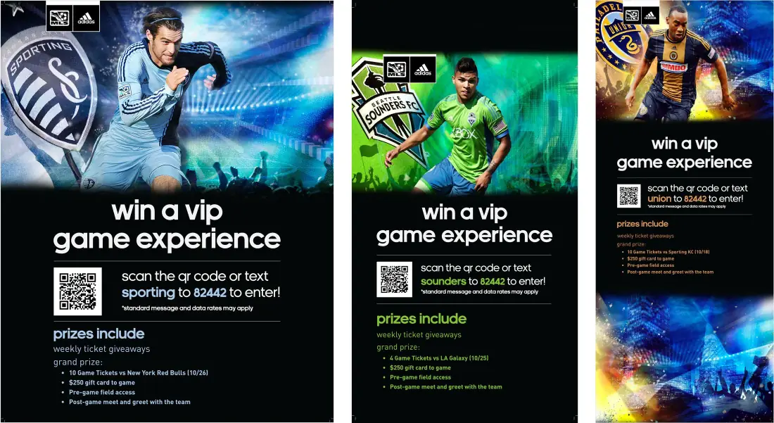
- adidas and MLS: two seasons of VIP game experiences, entered from store displays, social posts and team takeover sites.
- E.D. Smith: 14 seasonal campaigns over three years, under TasteCreator, the community we built for the brand.
Tagga was a small team running cross-channel campaigns for national and international brands. Past adidas and E.D. Smith, the list ran from Kicking Horse Coffee, Lindt and Sun-Maid to Gordmans, Vita Foods and Banamex.
Under the creative, every campaign had the same job: turn someone in a store, a stadium or a feed into a profile the brand could use. In my last two years I moved onto the platform that did that, as its UI/UX lead.
The campaigns
The biggest of them:
- adidas: engaged fans. adidas wanted to find the people who bought team gear and talked about it, and group them with their teams, online and off. Retailers and teams promoted photo and video contests on their own social channels, with VIP experiences, weekly ticket giveaways and signed merchandise as prizes.
- #NBASwingman. To find the real market for the swingman jersey, fans filmed How Swingman are you? videos and posted them on Instagram or Vine with the campaign hashtag. The prize was two tickets to the NBA Finals.
- NCAA football and basketball. Event campaigns. I designed for jumbotrons and stadium video boards that asked fans to text a keyword to a short code. The reply was a link to a mobile entry page.
- MLS. To help MLS compete with the bigger U.S. leagues, adidas wanted to know who its fans were. Over two seasons we ran in-store signings and displays, social posts and photo-contest sites for VIP game experiences.
- E.D. Smith: TasteCreator. The 133-year-old Canadian brand had an out-of-date website and no social presence. Over three years we built TasteCreator, an online community that became the new face of the brand, with new social channels, a new website and 14 seasonal campaigns aimed at a younger audience.
How a campaign worked
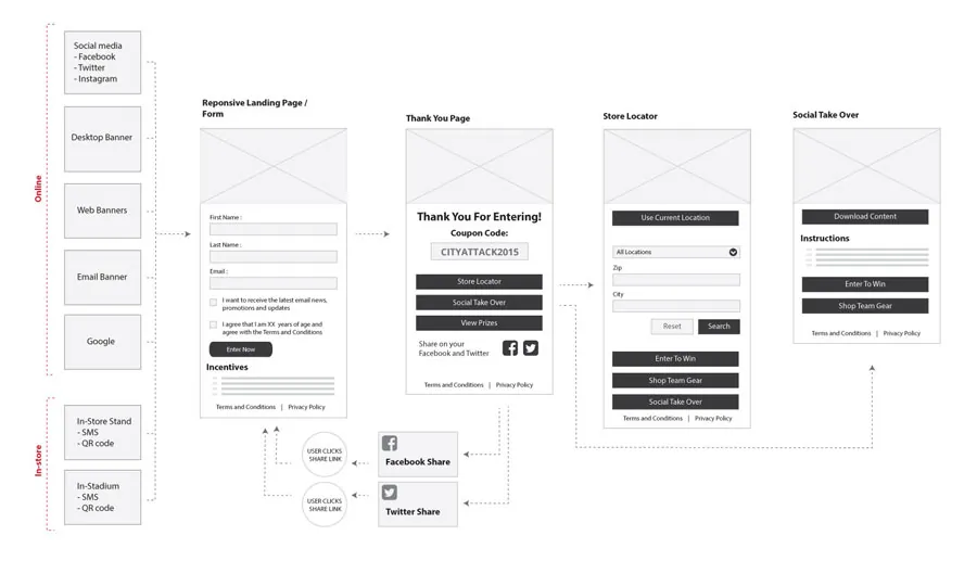
Every campaign ran on one flow. Each channel had its own URL, keyword or hashtag, from a store stand or a stadium screen to a tweet or an email banner. They all led to one responsive landing page and one entry form, often with social sign-in to make entering easier.
Entering always paid something back: exclusive content, a coupon or a store locator. Then the platform mapped and grouped the people behind the entries into profiles the brand could use.
We also made the content calendars and collateral that teams, players and retailers used to keep each campaign going.
The platform
All those entries fed Tagga’s own software. When I started it was a white-label SMS and mobile-site platform. It grew into a cross-channel campaign reporting tool, then a customer data platform that turned raw data from campaigns, APIs, file uploads and point-of-sale systems into customer profiles.
As UI/UX lead I worked with the product designer and the CTO. I started on paper, sketching layouts and motion from the user stories, and took the sketches to the front-end developer before the whole team reviewed them. When we disagreed on a flow, I built each version, sometimes as a video, so everyone could see it work before we chose. The last step was a working prototype in Adobe XD for the front-end developer.
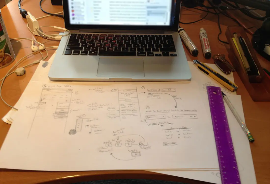
When we disagreed on a flow, I built each version, sometimes as a video, so everyone could see it work before we chose.
The segment page
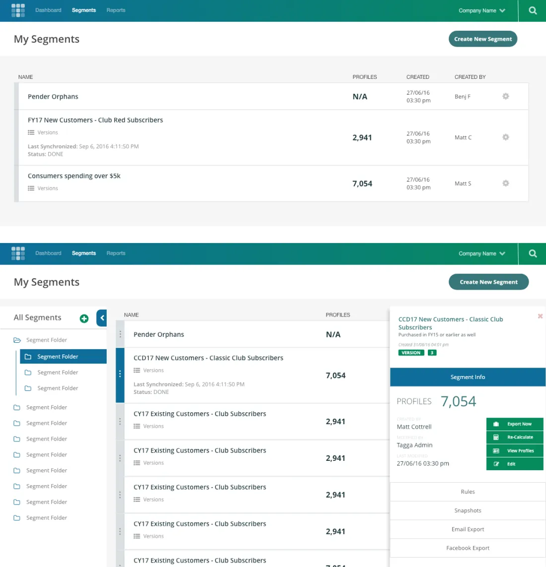
The segment page holds the groups of customers a brand cares about, like people who abandon their carts. It had to bend with the roadmap as the company grew and clients asked for more.
My first version was one long list. That broke when bigger clients had hundreds of segments. I tried two fixes: the page split between the list and segment groups, and folders in a sidebar the client could sort segments into. The sidebar won.
Later the detail panel’s tabs were hard to read, and information disappeared as you switched between them. I replaced the tabs with an accordion and kept a summary at the top that stays put, whichever section is open.
What it actually took
A small team doing everything. On most campaigns I was lead designer, front-end developer, UX and QA at once: the key visuals, the in-store print, the social posts, the responsive entry site, and the testing before it went live.
Over three years of E.D. Smith campaigns the team went from five people to two, which put the client relationship and the creative in my hands. For the Triple Fruits back-to-school campaign I worked with the recipe photography team on the key photo, directing how the items were laid out.
Before Tagga I spent ten years in print, making signs and running large-format printers and presses.