Work / 04 · Brand and shop
Terry Time
A shop for Terry, the face that keeps turning up on East Van walls. I designed seven storefronts, put two of them in a 50/50 split, and wrote down how the winner gets picked before the first visitor arrives.
- Role
- Design and build
- Year
- 2026
- Status
- Pre-launch
- Stack
- Next.js 15 · Stripe Checkout · Printful
- Numbers
- 7 storefronts · 2 in the test · 3 products
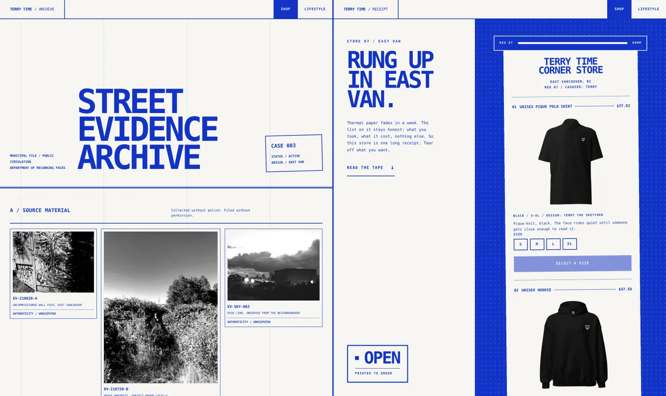
- Store A, the Street Evidence Archive. The shop is a municipal case file: Terry’s photos are filed as evidence and every product is an exhibit.
- Store B, the Corner Store Receipt. The catalogue prints as one long thermal receipt from register 07, rung up by Terry.
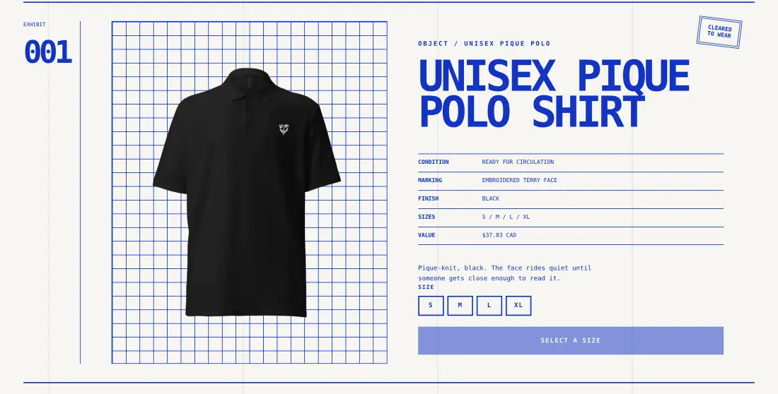
- Same products, prices, size picker and Stripe checkout in both. Nothing is preselected, so the button says Select a size until you pick one.
Running live
Terry, set in type.
The footer from Terry Time, running here on the shop’s own code, ported from React to plain JavaScript. Every cell reads the drawing under it, picks a glyph by weight and stroke direction, then keeps picking.
Move across it and the type switches faster. Flick fast and the ink smears into a red second plate, then settles.

Terry is a face that keeps turning up on East Van walls. Terry Time is his shop: a polo, a hoodie and a dad hat, each with the face embroidered on it and made to order.
I designed seven storefronts for it, and every one of them sold the same three things. Picking one on taste would have been a guess, so two of them go live side by side and paid orders decide.
The rule for calling it was written before the first visitor: once each store has had at least 300 visitors, the one with more paid orders per visitor wins. Until then, neither store changes.
What it is
One catalogue, two shops around it:
- Store A, the Street Evidence Archive. The shop as a municipal case file. Terry’s street photos are filed with evidence numbers, and each product is an exhibit with a condition, a marking and a value, stamped Cleared to wear.
- Store B, the Corner Store Receipt. The shop as one long thermal receipt: line items, dot leaders, a shelf total and a torn edge. Thermal paper fades in a week. The list on it stays honest.
- One design system under both. Brutal UX, ported in cobalt:
#1233c7ink on warm paper, zero radius, zero shadow. The two shops look nothing alike and share every rule.
The UX thinking
- Seven storefronts is a decision you haven’t made yet. A UX audit in September caught it: the home page was a chooser between five shops, so a visitor would land on a design review instead of a store. Five directions went to a branch, and two went into the test.
- A visitor only ever sees one store. Middleware splits
/and/shop50/50 and pins each visitor to their store with a cookie for 30 days.?v=aor?v=bforces one, so a post can promise a specific shop, and every Stripe checkout records which store it started in. - The rule came before the data. Each store needs at least 300 visitors, and the launch promotion has to be over. Then the store with more paid orders per visitor wins. If that’s within noise, the higher average order wins, then the one I’d rather maintain.
- Honest while it’s off. The site builds and runs with no keys at all. Until checkout is switched on, the buttons say it isn’t live yet instead of failing.
After hours
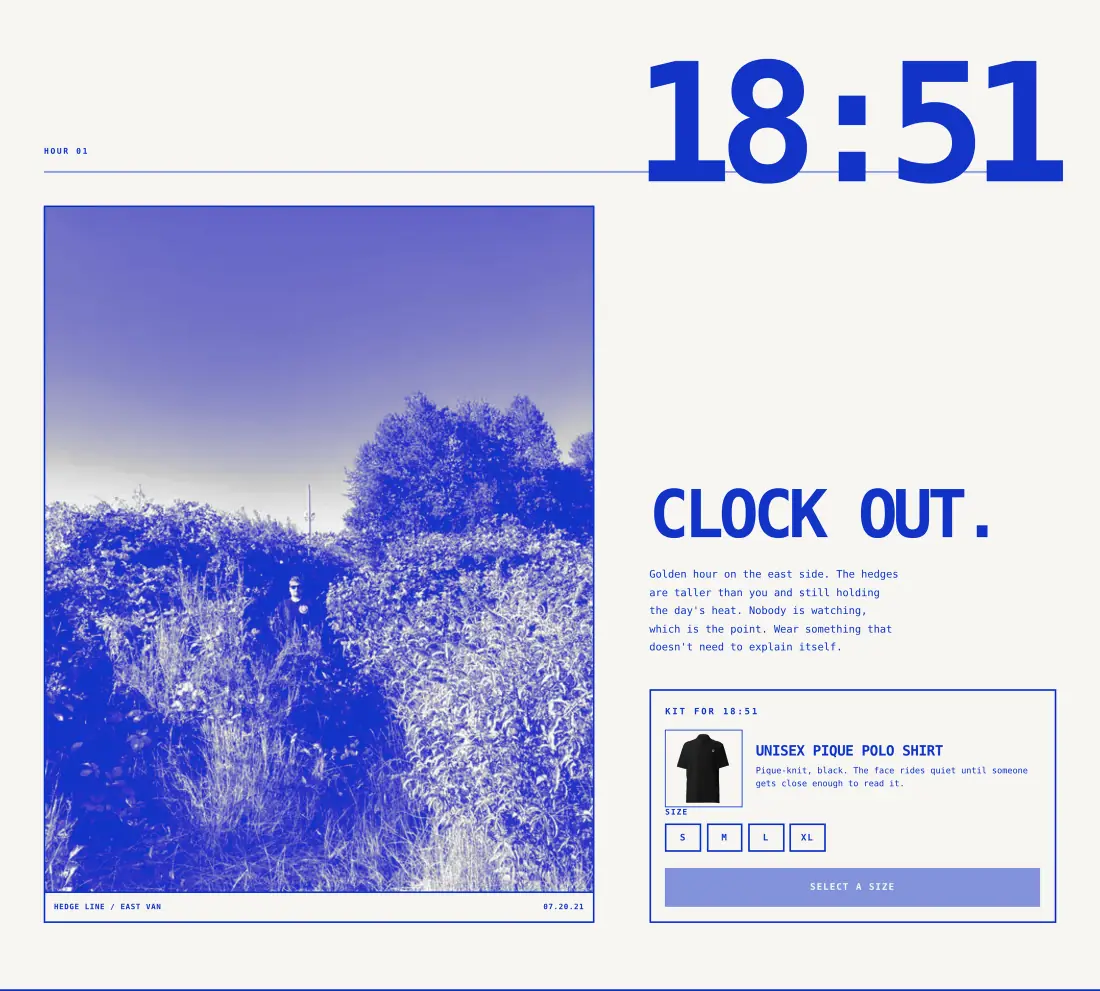
Both stores link to one shoppable lookbook, told in timestamps: 18:51, Dusk, 21:55. Each chapter is a photo, a line and the kit to wear in it, with the size picker right there.
What it actually took
The storefronts were the fun part. Selling a shirt is easy. Selling one without losing money on it is the job.
Checkout is Stripe’s hosted page, built from inline prices, so there’s nothing to set up in a dashboard. The browser only sends a product and a quantity. Prices and shipping are always set on the server.
Shipping took the most thought. Stripe’s hosted page can’t re-price by address, so each order pays one shipping line: the higher of Printful’s live Canadian rate and its US rate plus $2. Any address in either country is covered, and a flat rate per country takes over if Printful’s rates are down.
A paid order becomes a Printful draft, not a shipment. The webhook checks the signature, only fulfils sessions that are actually paid, and logs loudly if the order can’t be created, because by then the customer has already paid.
Before real money moves, npm run verify:live checks the chain end to end: the API keys, every size linked to a Printful variant, stock, margin per size after Stripe’s fees, a test checkout and the webhook. It also surfaces Printful’s one-time $9.60 embroidery digitization fee, which puts the first order of each design up to $6.40 in the red.
Selling a shirt is easy. Selling one without losing money on it is the job.
Terry keeps appearing
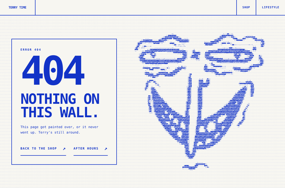
Footers and error pages draw Terry’s face in a grid of type symbols that never stops switching. It runs on WebGL2, falls back to a canvas still, and holds a single frame for anyone who has asked for reduced motion. The same piece is running live near the top of this page.
Roadmap
What’s left between two working storefronts and one winner.
Shipped
The build
Both stores, the lookbook, sizes, shipping and checkout, with all nine sizes linked to Printful.
Next
Real-money test
Live keys, three real orders landing as Printful drafts, and one shipped to a friend to time the delivery.
Planned
Launch
Checkout goes live and the split starts counting.
Planned
Call it
At 300 visitors per store, with the launch promotion over, the winner becomes the shop and the other goes to a branch.